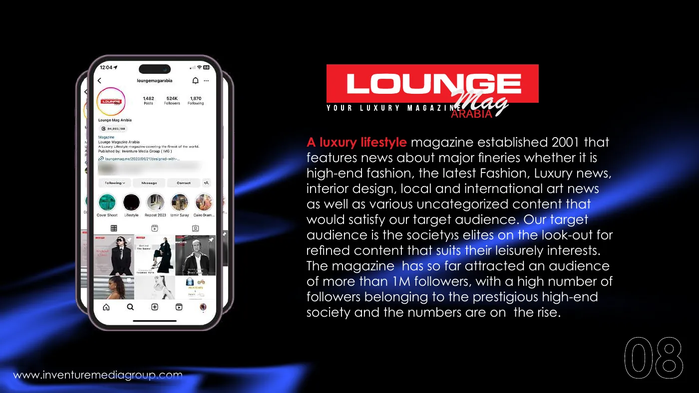
The challenge
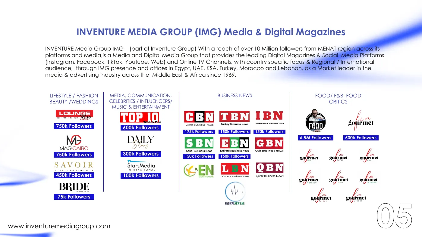
Two companies with a lot to show and no single visual story to show it with: a media group with dozens of digital magazines, and an advertising agency that wanted a profile with one clear idea behind it.
The solution
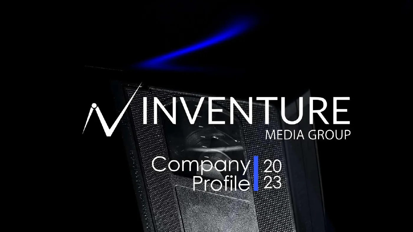
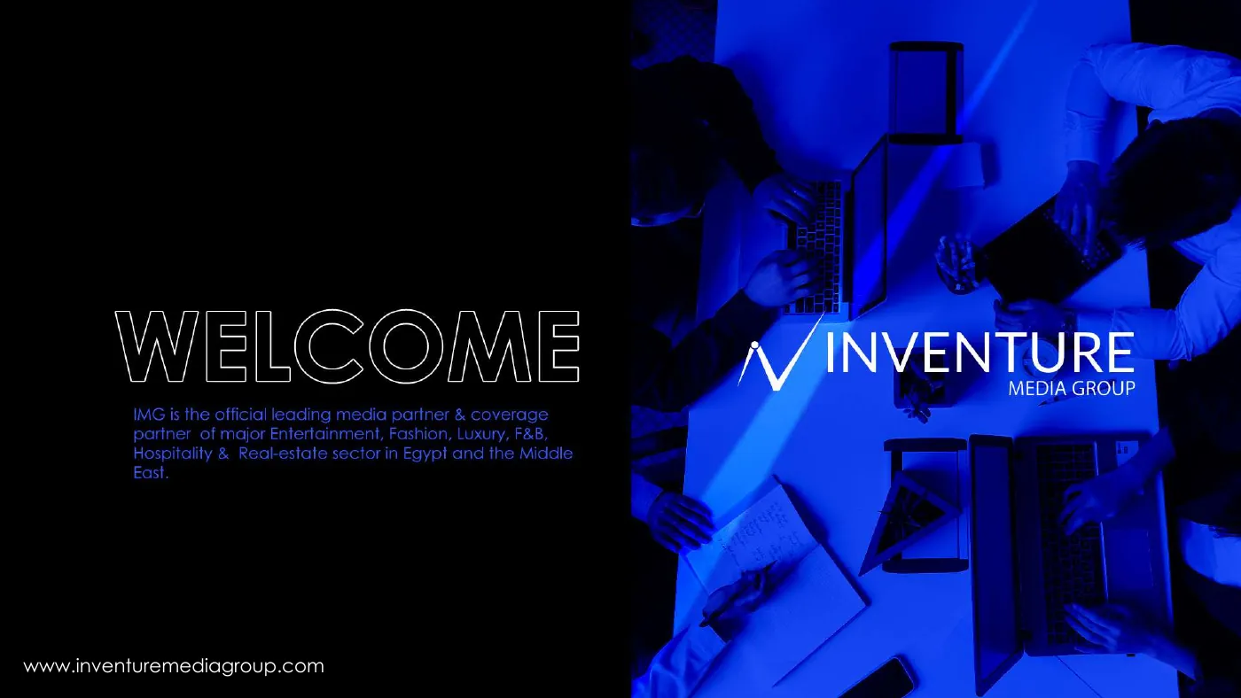
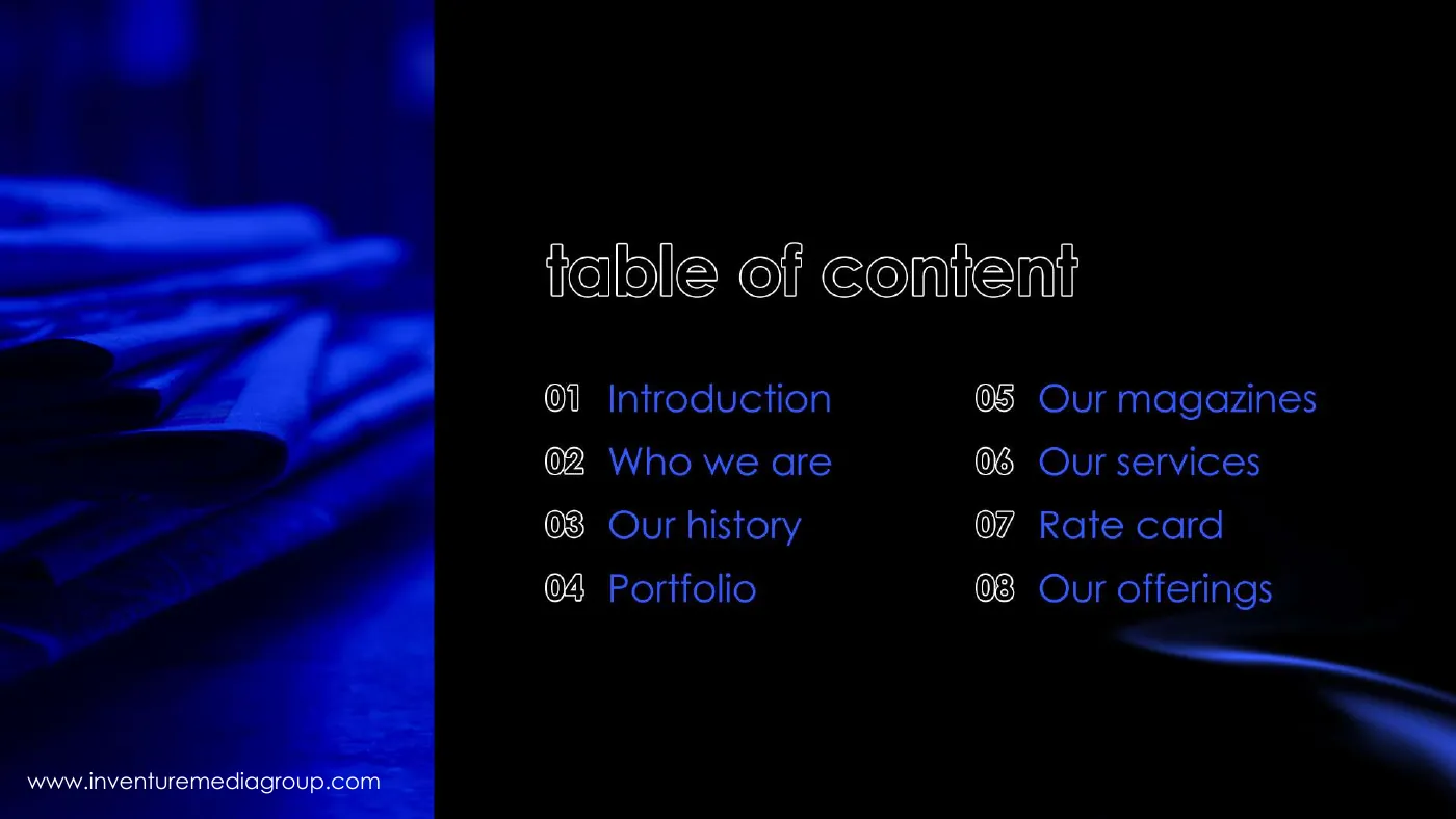
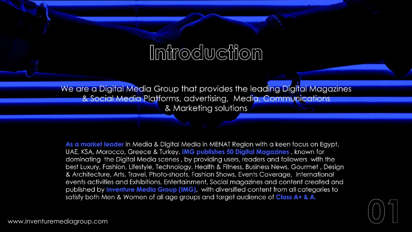
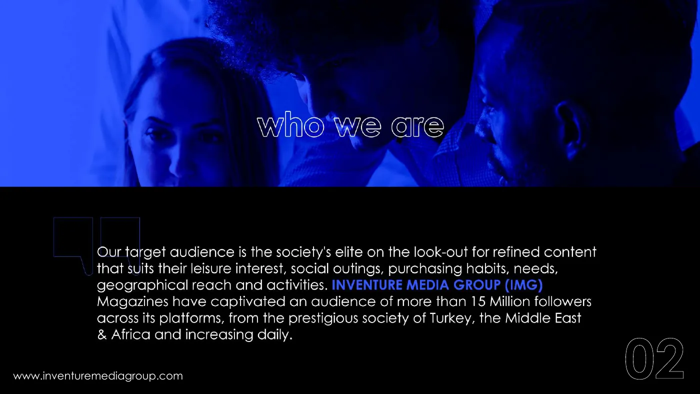
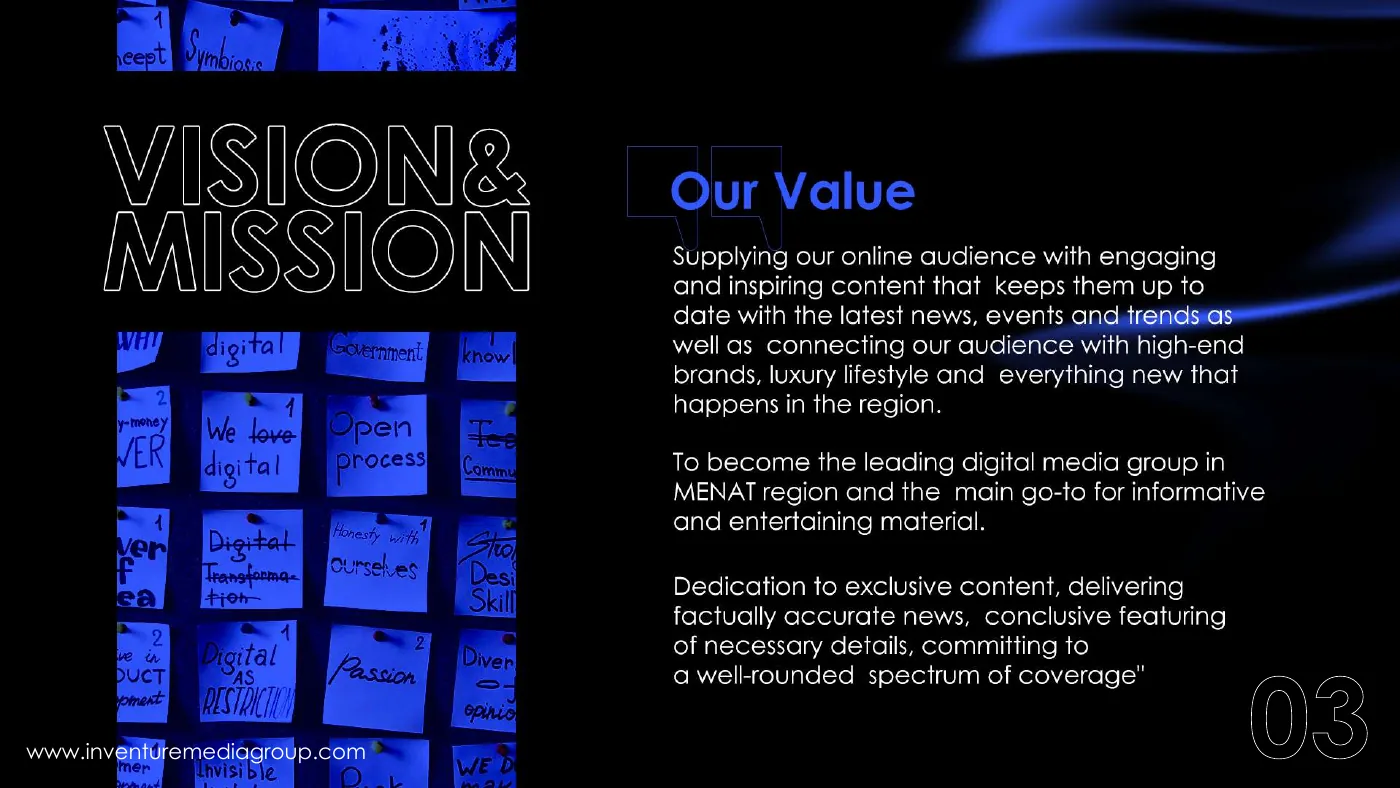
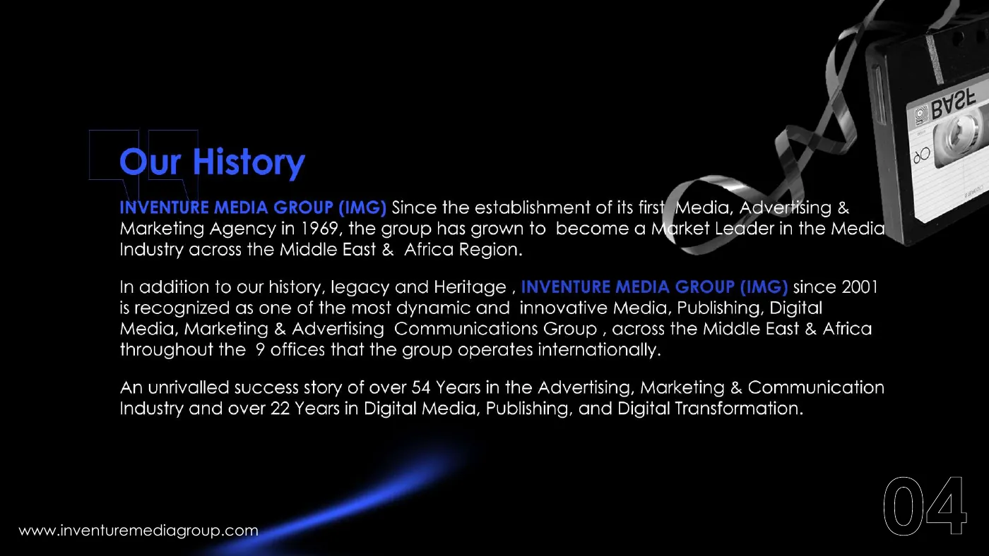
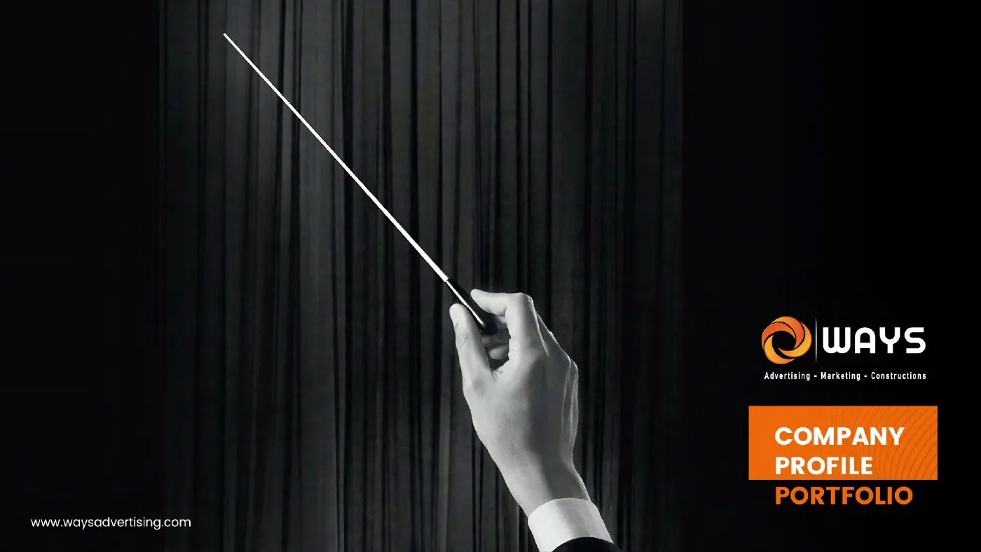
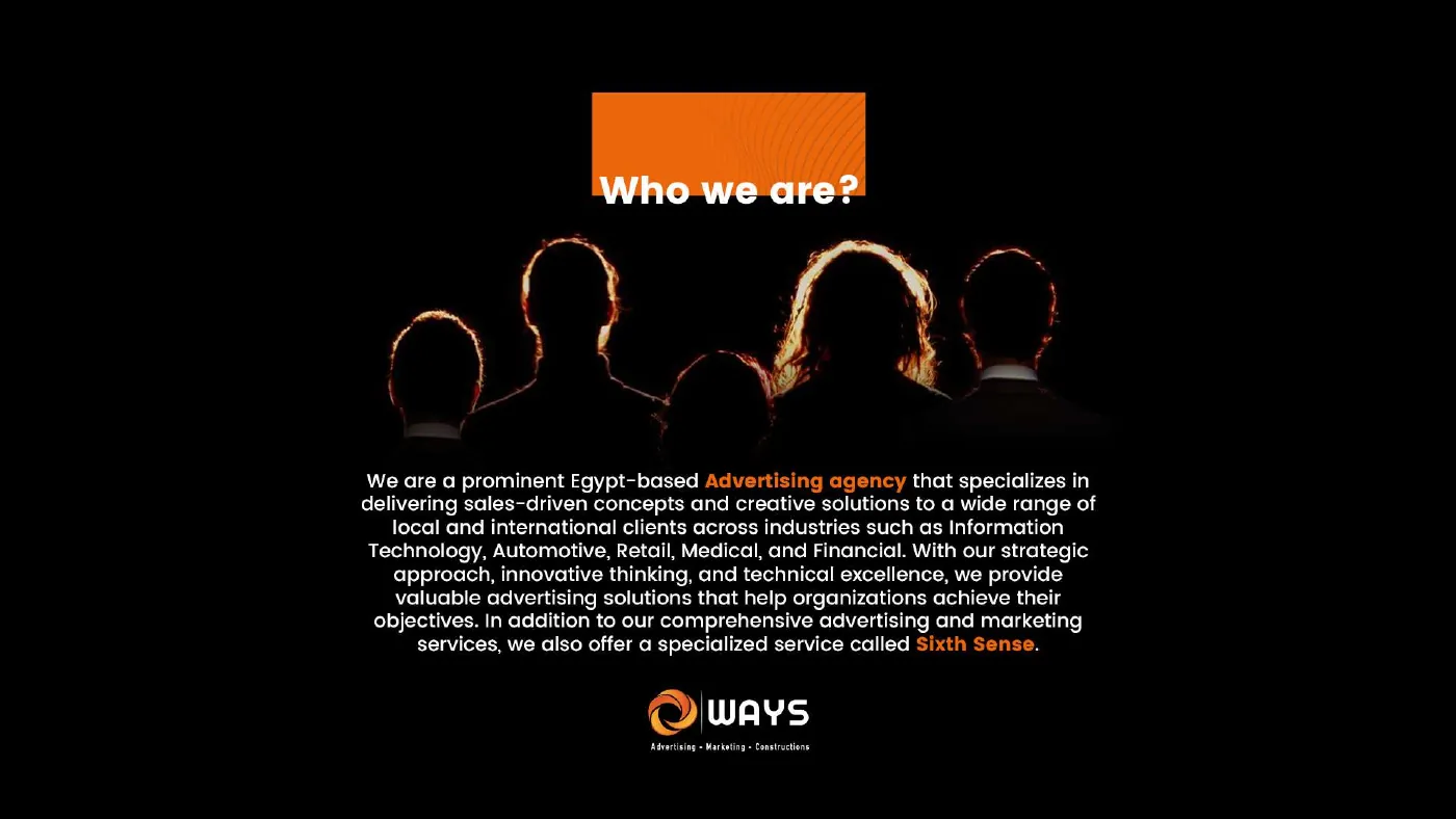
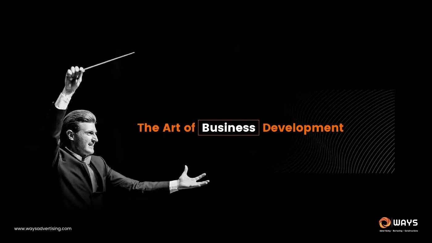
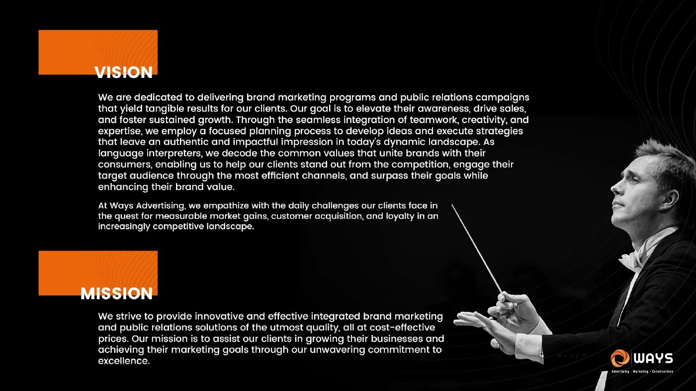
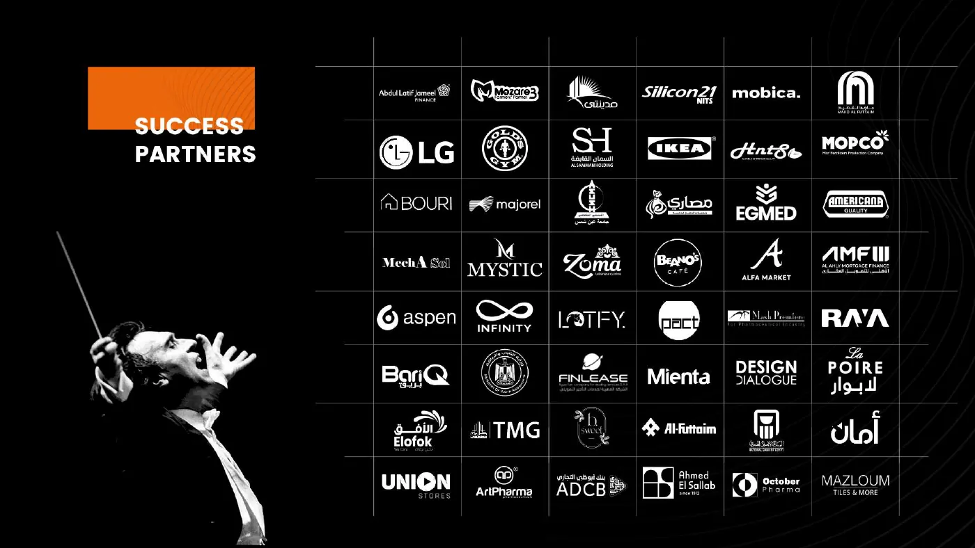
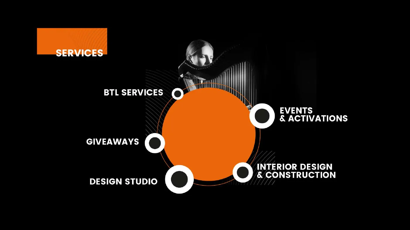
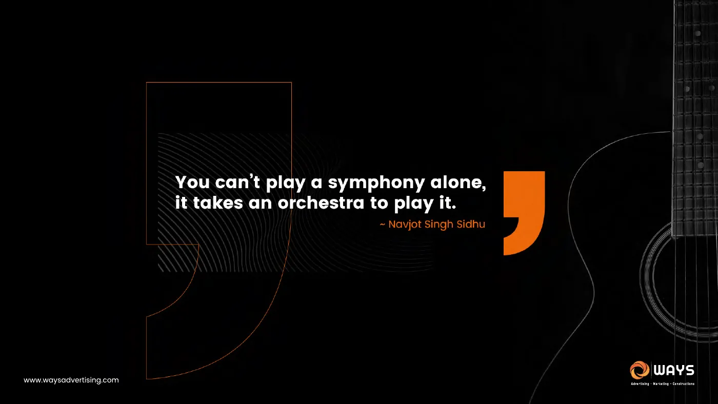
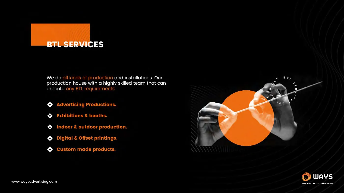
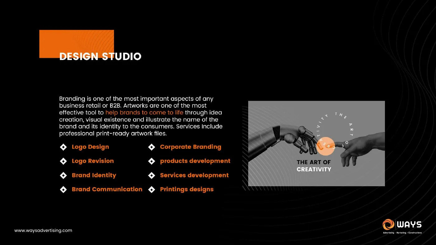
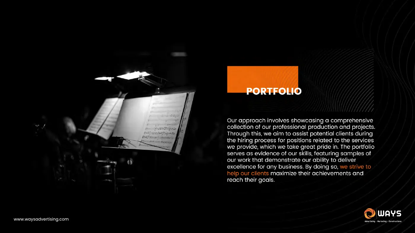
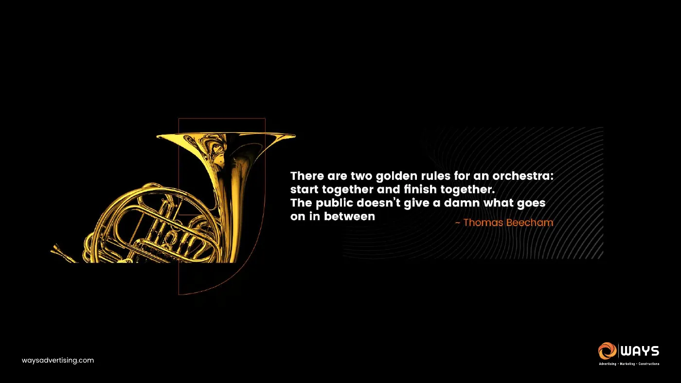
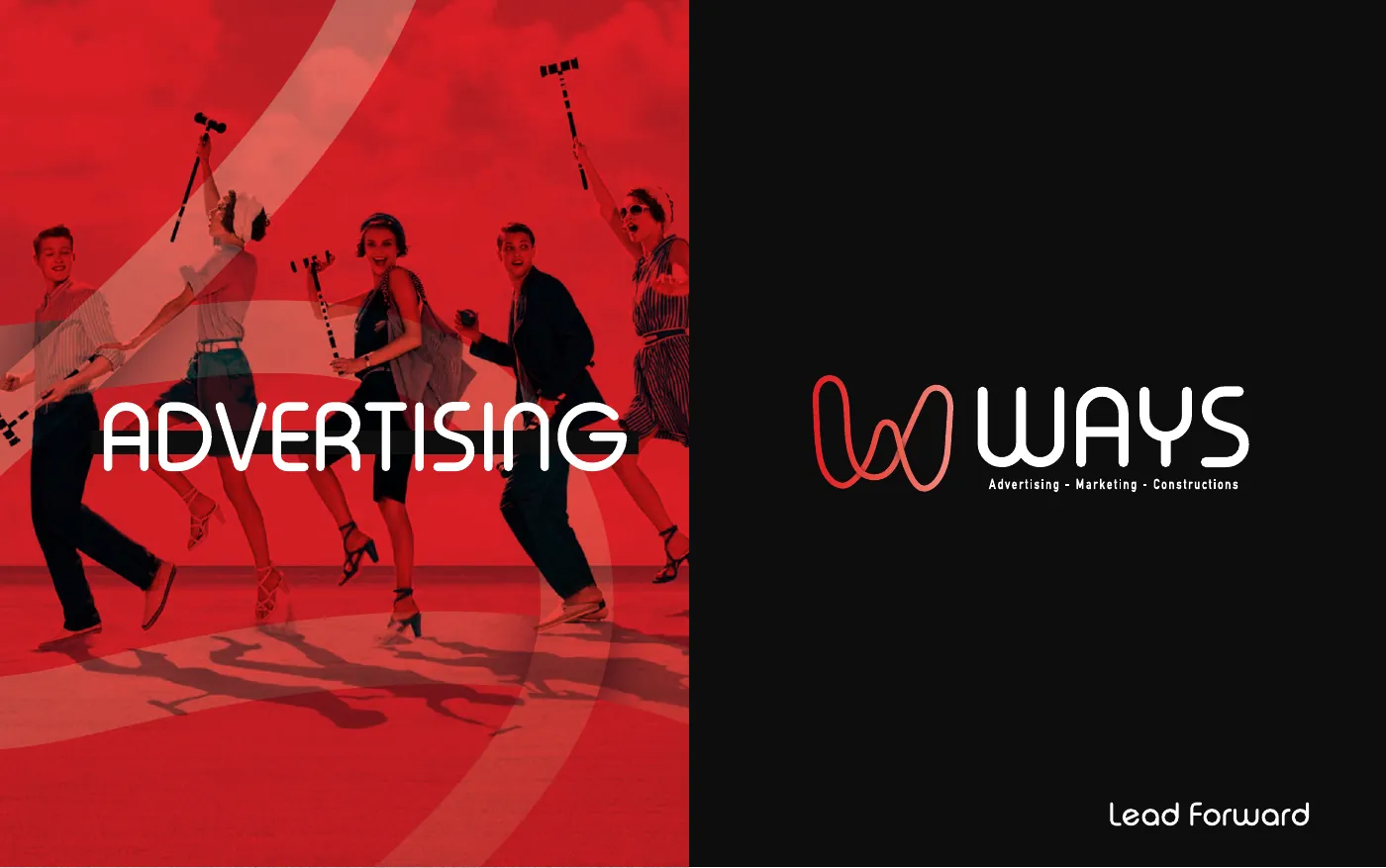
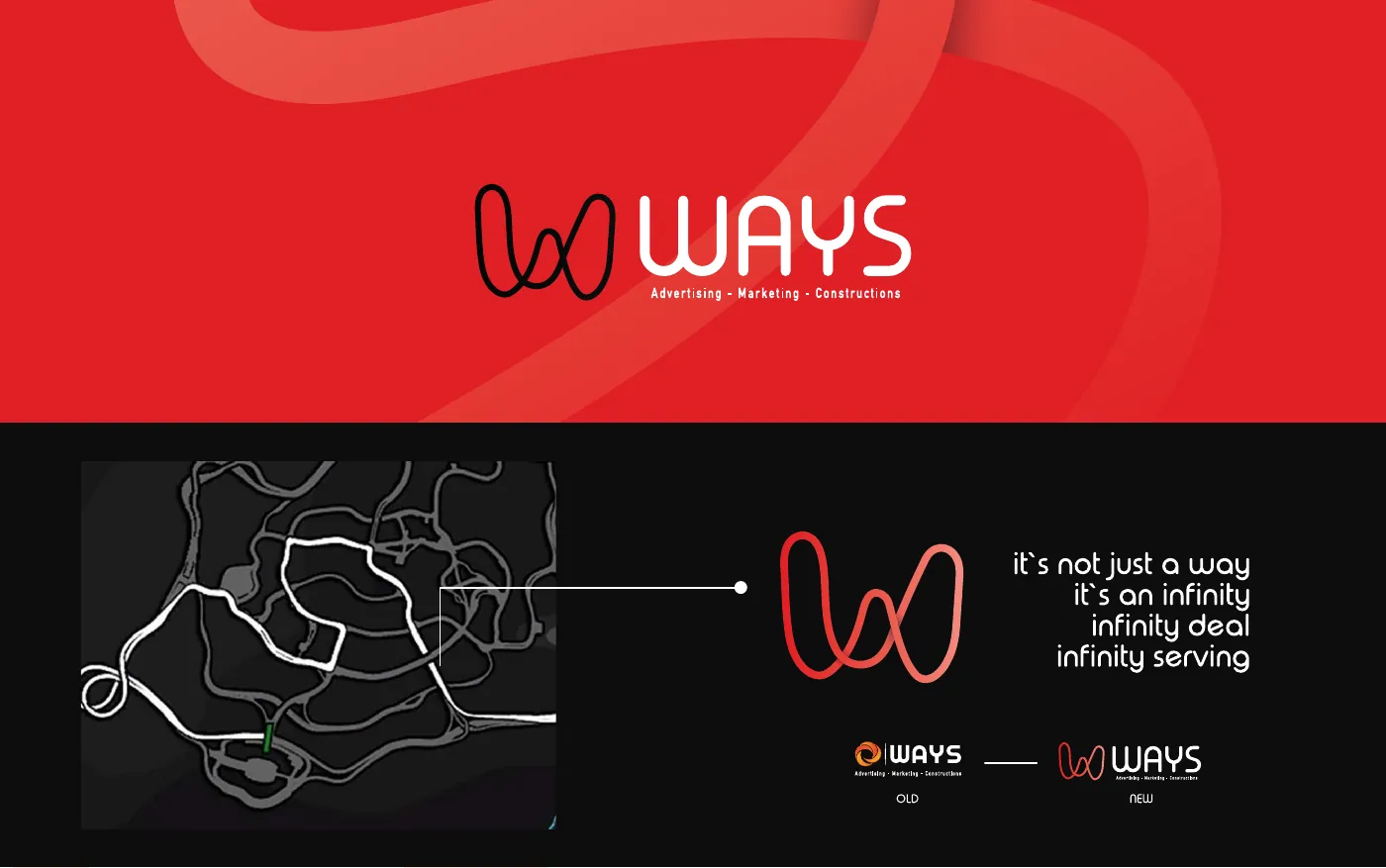
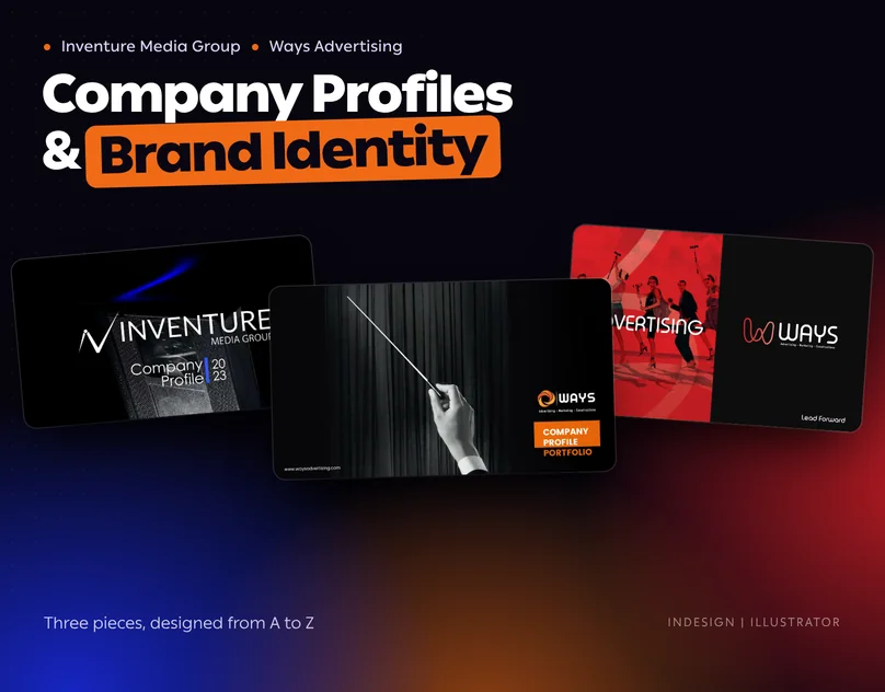
Three pieces designed from A to Z: a 130-page company profile for Inventure Media Group, a 65-page company profile for Ways Advertising built on the idea of an orchestra, and an alternative brand identity for Ways drawn from one continuous line.
The approach
Each document starts from one idea the reader can repeat after closing the file. Inventure is one group, not a list of magazines. Ways is an orchestra of specialists. The Ways mark is a way that never ends. Layout, colour and imagery are then chosen to serve that idea on every page.
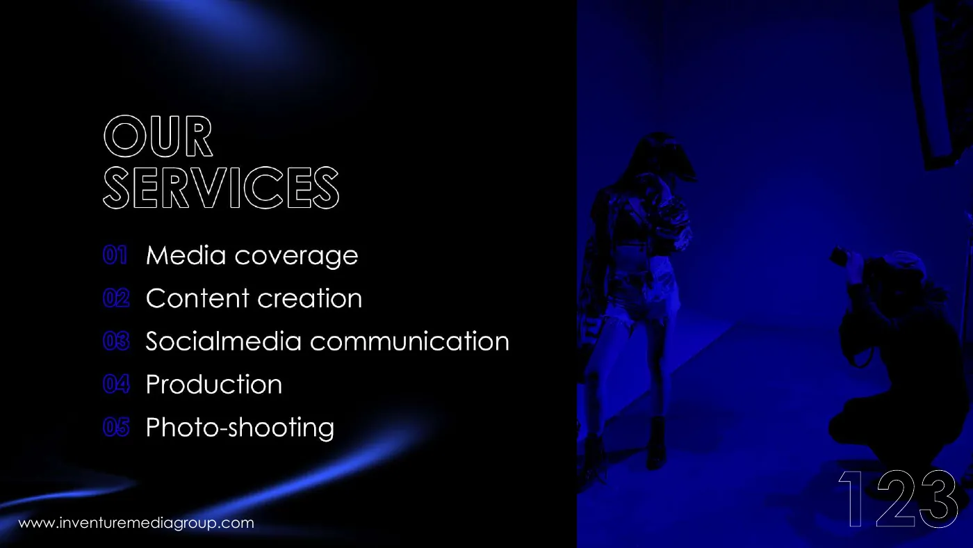
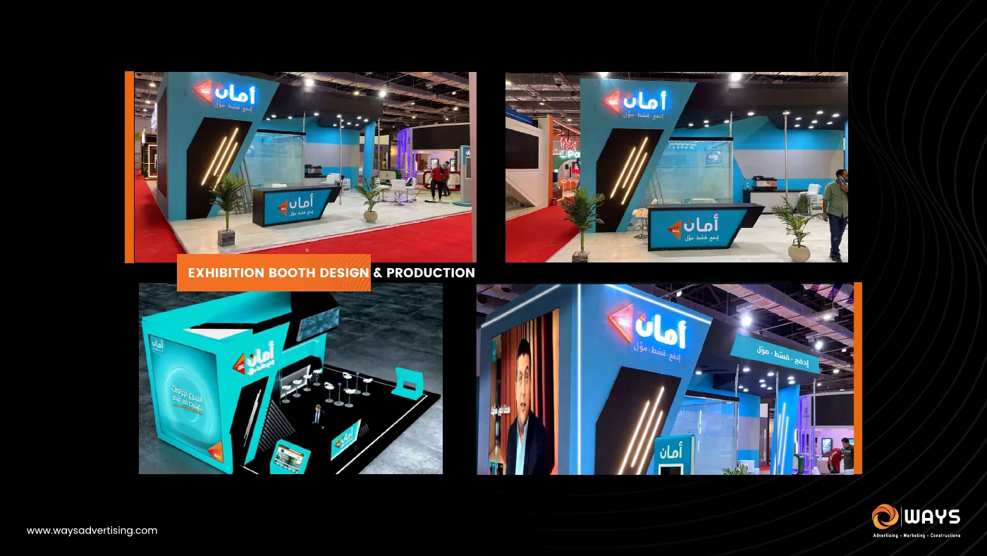
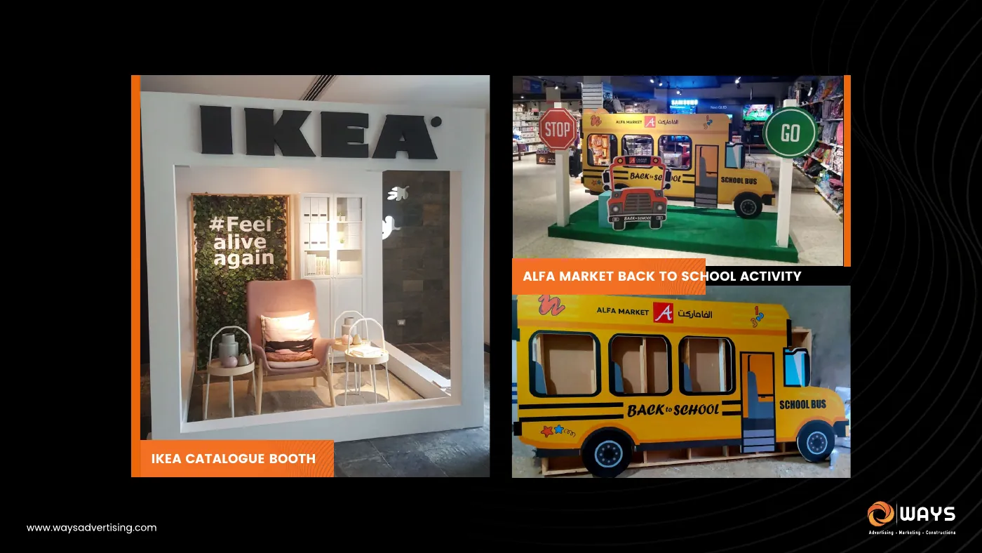
Long documents stay readable because the system is fixed: one grid, one accent colour, one way to open a section and one way to label a page. Repeated page types were designed once and reused, which is why 130 pages still read as one piece.
Project focus
- One idea behind each document
- A fixed grid and colour system
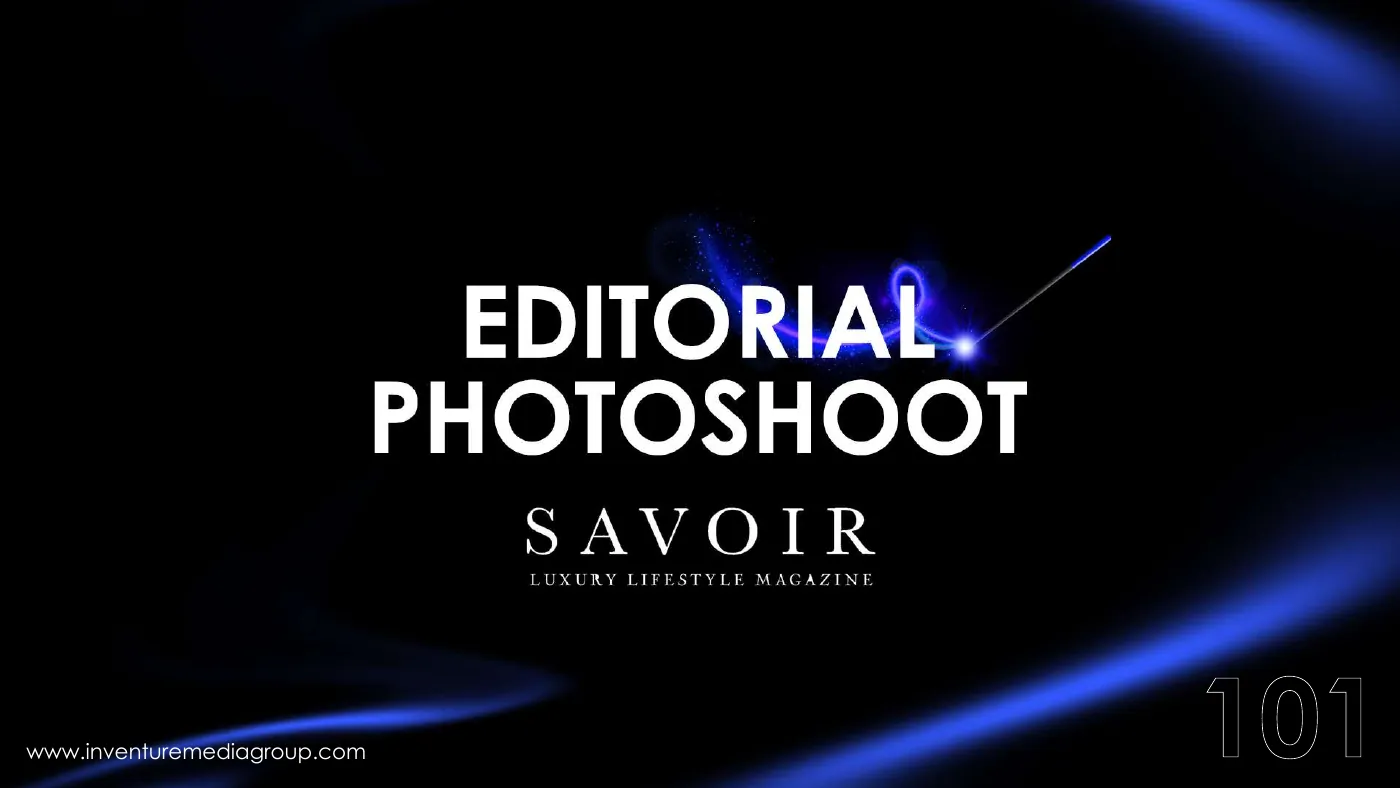
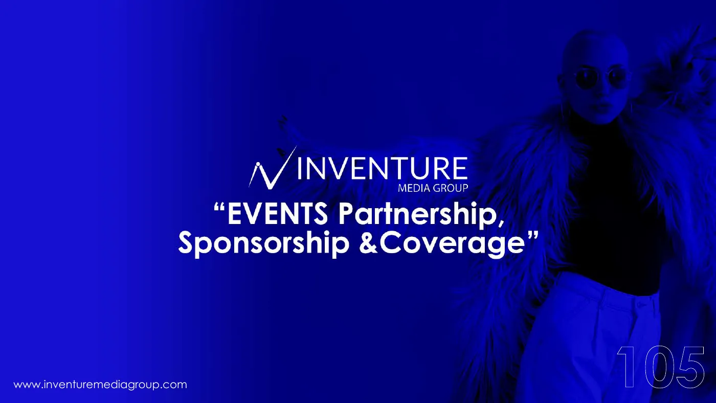
- Section openers that pace long documents
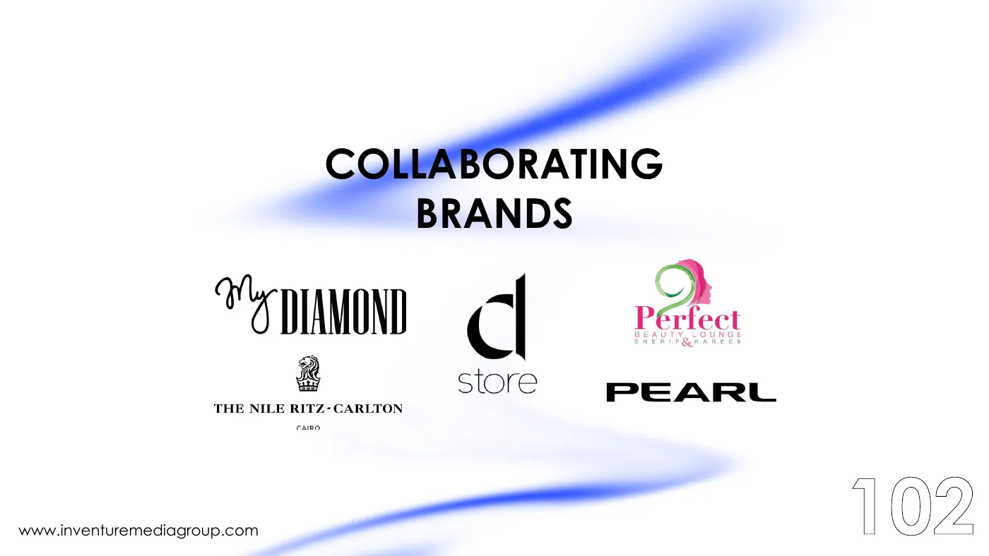
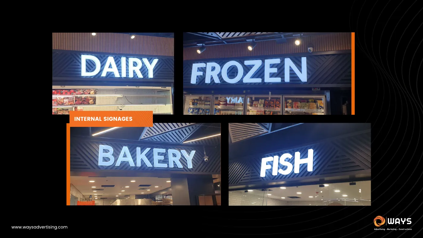
- Logo walls and portfolio pages that stay consistent
- An identity built from a single line
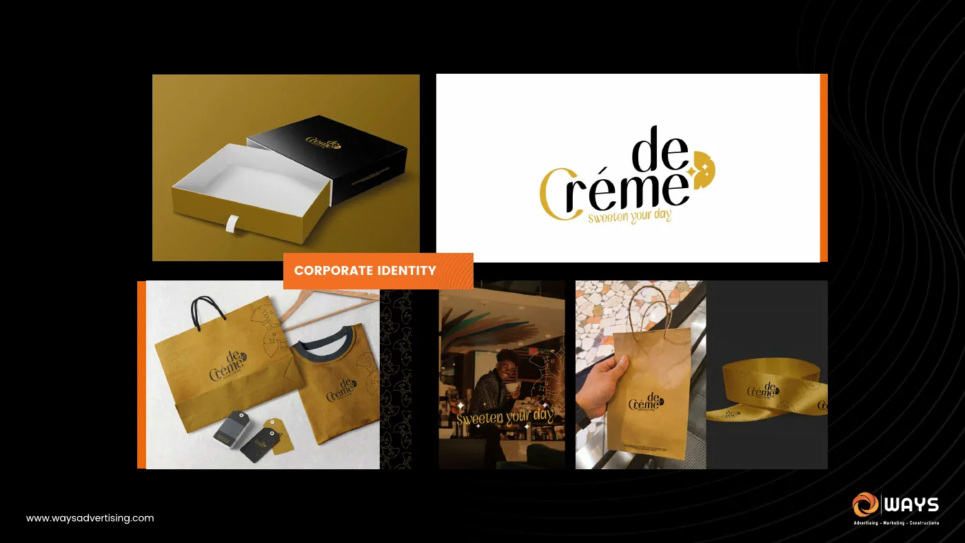
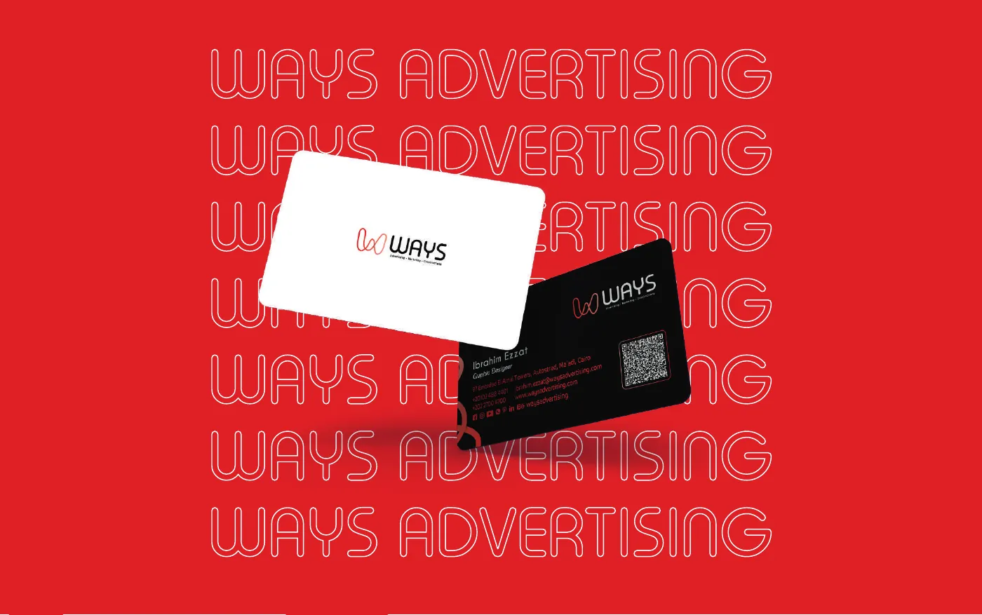
- Applications: covers, cards and stationery
Outcome
Each company gets a document it can send to a client as it is: a clear story at the start, a system that holds on every page, and a look that belongs to that company alone. Each piece is shown below with a selection of its pages. Repeated layouts, price lists and personal photos are left out.